‘Big E.R.P.’ has become a straight-jacket for many big businesses whose business processes have changed significantly since implementation, but their software has not kept up. The result is, it compromises their flexibility and prevents a business from truly thriving. Hence the term 'straight-jacket'.
If you are a small business, you can learn from and take advantage of these restrictions on ‘Big Business’ by installing ‘Small E.R.P.’ that is flexible and expandable. Thereby, allowing your business to grow and truly thrive, while at the same time, the software expands and changes with you and does not act as a restraint on your activities. It is far easier to do this in a small business than in a large business.
To achieve this you must ignore the ‘Big E.R.P.’ systems and look for the ‘Small E.R.P.’ systems and suppliers. Your first task is to select a system whose 'software base' closely matches your current requirements. Having selected such systems out of the multitude available, you then need to ensure that the software supplier is able and willing to form a 'business partnership' with your business.
This 'business partnership' is essential in order that as you grow and your business processes change, they can change and grow the software in partnership with you.
If a supplier is only interested in selling you a system 'straight out of the box', move on and look for a software supplier that can truly support your business. It is the support that is the crucial element and is the part most often overlooked by small businesses.

Discusses views from the UK both cultural and political. With a distinct interest in software.
13 October 2016
10 May 2016
Scalable Vector Graphics - Simple Pie Charts
In addition to line and bar charts, most business will use pie charts in their management reports. This article explains how simple pie charts can be added to reports using the SVG HTML tag and the abilities of CSS transformations and animations.
In case you want to refer to a more detailed explanation of how to construct these pie charts and the CSS issues involved, please refer to Designing simple pie charts, the article that I used in putting together my own charts.
We start with a simple circle rendered via CSS. To do this we need the following HTML tag.
<div class="pie"></div>
And the CSS style commands of
.pie {
width: 100px; height: 100px;
border-radius: 50%; background: yellowgreen
}
Skipping a few steps that are explained in detail in the referenced article we end up using the "transform" and "animation" abilities of CSS with this HTML and CSS code:
<div class="pie" style="animation-delay: -25s"></div>
@keyframes spin {
to { transform: rotate(.5turn); }
}
@keyframes bg {
50% { background: #ff0000; }
}
.pie::before {
content: '';
display: block;
margin-left: 50%;
height: 100%;
border-radius: 0 100% 100% 0 / 50%;
background-color: inherit;
transform-origin: left;
animation: spin 3s linear infinite, bg 6s step-end infinite;
animation-play-state: paused;
animation-delay: inherit;
}
.pie {
width: 100px; height: 100px;
border-radius: 50%; background: yellowgreen
}
The style="animation-delay: -25s" addition to the DIV tag uses negative animation delays to step through to any point in the animation statically and stay there, in the words taken from the source article to which you are again referred. For our requirement, the 25 sets the percentage of the circle to hi-light. Building on this HTML and CSS it is easy to construct an interactive page to show numerous pie charts (here 4) based on entered figures and negative animation delays. With each amount converted to a percentage which is used to show the Pie Chart.
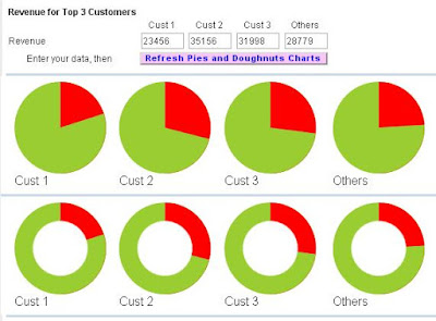
The above image shows each element of data in a separate pie chart, rather than combined in one pie chart as normally seen. This is a small draw back, but it would appear that for dynamic data usage, forming a single pie chart possess a lot of CSS problems. See reference article. So, although not perfect, dynamic Pie Charts can be used in management reports, just not in the traditional manner. This may not be such a big drawback as it allows the report designer to be inventive in the type and style of graphs used.
Finally, by adding a circle via CSS ::after code, with the background colour of the page, we can create a doughnut!
.pie::after {
content: '';
display: block;
margin-top: -96%;
margin-left: 20%;
height: 60%;
width: 60%;
border-radius: 50%;
background-color: #ffffff;
animation: spin 50s linear infinite;
}
So the only question left is - do you prefer PIES or DOUGHNUTS
22 April 2016
Scaleable Vector Graphics - SVG tags for graphic display of data extracted from accounting software!
With the increasing number of browsers, business applications need to allow users to use these browsers and still have graphic capabilities outside of the MS Office Web Component mentioned here in March 2011. The limitation of the OWC is that it can only be used under IE.
This limitation is lifted by the HTML "Scaleable Vector Graphics" tag SVG.
Using the SVG tag and its subordinate tags of G, LINE, POLYLINE, TEXT, etc. dynamic graphs can be produced under HTML reflecting data held within business and accounting software. Typically these graphs will be simple bar and line graphs, although more complex graphs can be constructed.
Subscribe to:
Posts (Atom)