In case you want to refer to a more detailed explanation of how to construct these pie charts and the CSS issues involved, please refer to Designing simple pie charts, the article that I used in putting together my own charts.
We start with a simple circle rendered via CSS. To do this we need the following HTML tag.
<div class="pie"></div>
And the CSS style commands of
.pie {
width: 100px; height: 100px;
border-radius: 50%; background: yellowgreen
}
Skipping a few steps that are explained in detail in the referenced article we end up using the "transform" and "animation" abilities of CSS with this HTML and CSS code:
<div class="pie" style="animation-delay: -25s"></div>
@keyframes spin {
to { transform: rotate(.5turn); }
}
@keyframes bg {
50% { background: #ff0000; }
}
.pie::before {
content: '';
display: block;
margin-left: 50%;
height: 100%;
border-radius: 0 100% 100% 0 / 50%;
background-color: inherit;
transform-origin: left;
animation: spin 3s linear infinite, bg 6s step-end infinite;
animation-play-state: paused;
animation-delay: inherit;
}
.pie {
width: 100px; height: 100px;
border-radius: 50%; background: yellowgreen
}
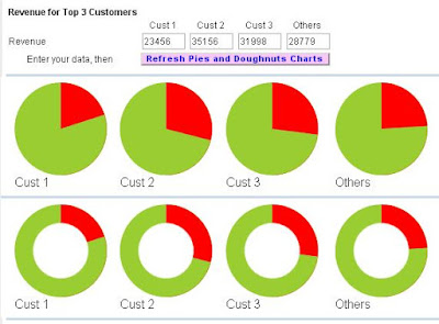
The style="animation-delay: -25s" addition to the DIV tag uses negative animation delays to step through to any point in the animation statically and stay there, in the words taken from the source article to which you are again referred. For our requirement, the 25 sets the percentage of the circle to hi-light. Building on this HTML and CSS it is easy to construct an interactive page to show numerous pie charts (here 4) based on entered figures and negative animation delays. With each amount converted to a percentage which is used to show the Pie Chart.
The above image shows each element of data in a separate pie chart, rather than combined in one pie chart as normally seen. This is a small draw back, but it would appear that for dynamic data usage, forming a single pie chart possess a lot of CSS problems. See reference article. So, although not perfect, dynamic Pie Charts can be used in management reports, just not in the traditional manner. This may not be such a big drawback as it allows the report designer to be inventive in the type and style of graphs used.
Finally, by adding a circle via CSS ::after code, with the background colour of the page, we can create a doughnut!
.pie::after {
content: '';
display: block;
margin-top: -96%;
margin-left: 20%;
height: 60%;
width: 60%;
border-radius: 50%;
background-color: #ffffff;
animation: spin 50s linear infinite;
}
So the only question left is - do you prefer PIES or DOUGHNUTS

